As I think through how to develop my farm project into an interactive documentary, I want to do an analysis of many different docs already online. Today’s Interactive Doc: Snow Fall
Design Elements
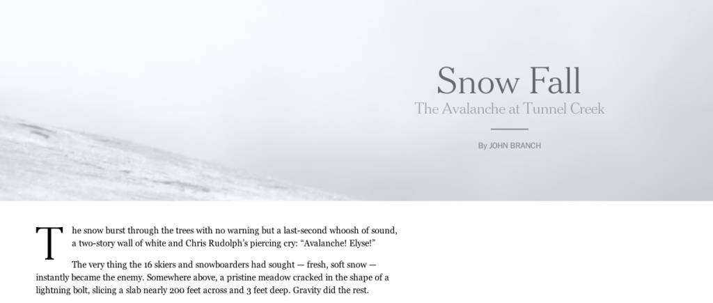
- parallax at top, with cinemagraph? of snow
- standard text/copy
- embedded brief video of survivors [less than minute]
- animated video of mountain/map
- embedded photos
- thumbnails on left side of victims, links to slideshows
- big slideshow
- gallery of photos (not clickable links)
- video footage of ski route
- audio clips
Responsive?
Yes
Content
- Traditional journalism
- story about avalanche
- single event w/context
Storytelling
- Traditional linear narrative
- w/supplemental material
Strengths
- beautiful footage
- interesting and useful content
- responsive
- powerful video footage
- cool use of parallax (with cinemagraphs) at top
- turned into an ebook
- static nav bar at top
- combined footage into 10 min documentary
Weaknesses
- too linear/traditional narrative
- margins on website–doesn’t fit wide screens
- too much text, not enough creative use of material
- no links to extra content, only embedded…would like extra page w/resources + links
To Use?
- ebook idea
- audio footage
- thumbnail slideshows w/people?
- combine footage into one longer doc?
Note: Since their success with this Snow Fall story, the NY Times has been working on a new interactive documentary with the super-cool National Film Board of Canada: Highrise. It will debut at the New York Film Festival at the end of this month.
Addendum as of 9.11.13: I just got a free sample of the ebook for this interactive documentary. Very disappointing. Unless I’m missing something, it’s just the text, without any of the online interactive features. Why not incorporate the videos, audio, images into the text?