
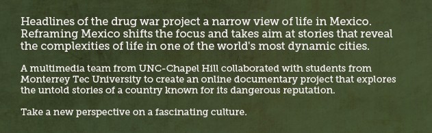
I found this “online documentary project” a year ago and was immediately impressed with many of its features and its focus:
As I began working on my analysis for this site, I realized that one important part of my assessment was not mentioned in my first interactive doc. analysis on Snow Fall: interactivity. What are the different ways that the audience can interact/participate in the project? So, I’ve added it to my analysis below.
Design Elements
- home page offers (almost) full-screen slideshow that starts on an introductory video, then cycles through featured stories (image which, when clicked, starts a Vimeo video + summary + related material)
- embedded Vimeo videos
- 12 key organizing terms/clickable links at top of homepage
- navigation bar includes icons for home, films, info graphics + EN (english) and ES (spanish) + an info icon (credits)
- bottom right corner provides links for comments (Facebook social plugin) + icon links to the 2 universities that collaborated on project
- site pages (accessible through clicking on one of 12 terms at top) are grids (one big rectangle + series of smaller rectangles) with video or info graphics
- each content box uses icon to identify type of content
- on info graphic page, content boxes light up when you mouse over them + they open light box when you click on them. Info graphics include one page graphs/charts/info, games or multi-page content
Responsive?
No.
Content
- Series of individual stories about different people living in Mexico, told in their own words (short videos)
- A mix of stories, combined with history, demographic information and games
- Features on goth culture, Mexican wrestling, running a family quesadilla stand, fighting against disability discrimination, etc.
Storytelling
- Non-linear, no beginning, middle, end
- Multiple ways of accessing and engaging with information
- Multiple perspectives and interpretations of content (videos are re-used to highlight different key terms)
- Focus on subjects communicating stories in their own words
- Emphasis on visuals
Interactivity
- comment, using facebook social app
- play games
- click on links/stories you want to and when you want to (direct order/shape of the stories)
- share site with others (using “share this”)
Strengths
- nice use of grid design and Vimeo video embeds
- strong organization, with clear ways to navigate and understand content + multiple ways to access information
- clear and compelling mission: to allow user to rethink how they understand Mexico and reframe how it’s represented
- great introductory video: brief (only 47 seconds), compelling, uses footage from various digital stories
Weaknesses
- not responsive
- not enough interactivity, participation by user
- feels too much like a standard website
- too many themes (12) w/relatively small amount of content repeated in different theme
Things to Use?
- icons identifying type of content in boxes
- grid design?
- clear/compelling organization with themes (but fewer)
- separate pages (easily accessible) for each type of content
- short video introduction
- homepage slideshow?
While scrolling through this site, I clicked on the Multimedia Gallery for the UNC School of Journalism and found this cool online documentary: Finding the Uwharries.