I’m not sure whether or not I want to develop an app for this project. Are they the best way to tell and share stories? To get people engaged with the project? I’m not convinced that an app is needed. While browsing through the Cowbird FAQ the other day, I came across their answer to the question: Do you have an app?
No. We think Apps are destined for obsolescence — they’ll be the CD-Roms of tomorrow. We believe in the open Web. That said, you’ll find that Cowbird works well on your smartphone.
Cowbird
I like this answer. And, I like how the site works on my phone. In a post a week ago I mentioned how my embedded story wasn’t responsive. It kept getting cut off on the phone. Not sure if that’s a problem with Cowbird or with my theme? For now, I’m not sure it matters; I like the idea of directing people to Cowbird.
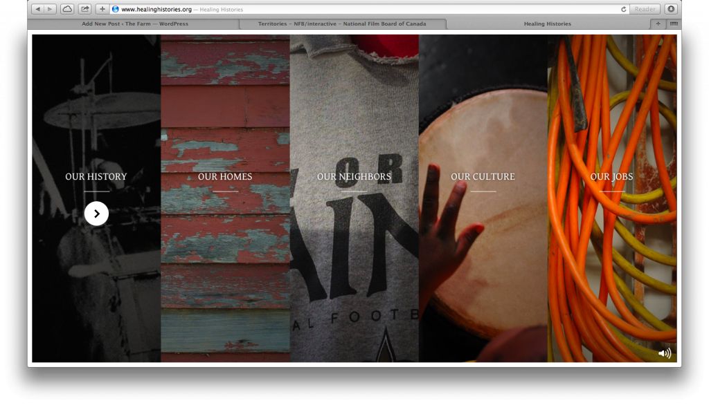
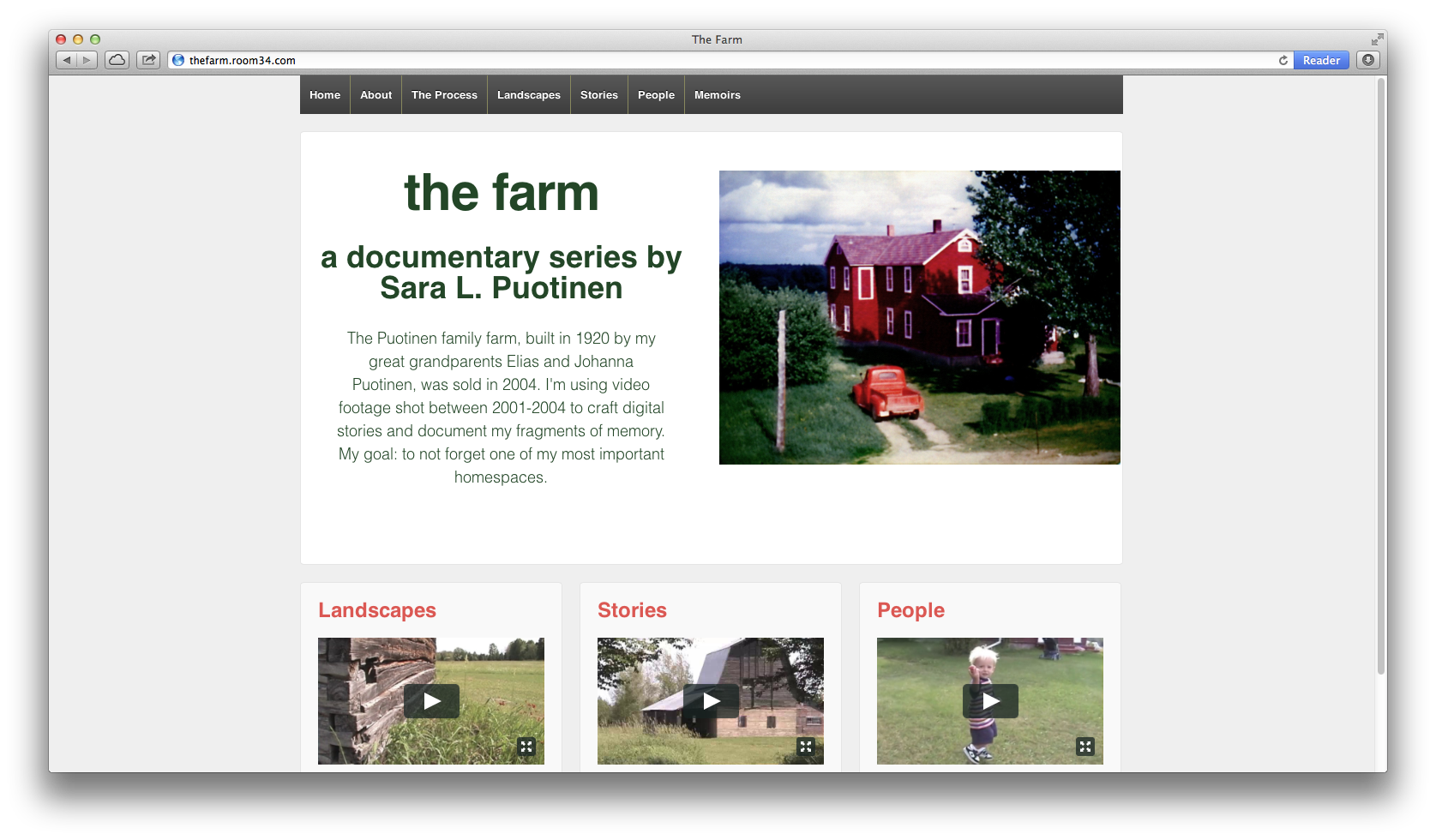
One of the key parts of The Farm is an interactive documentary. Inspired by the tradition within Finnish American culture (and amongst the Puotinen women) of weaving rag rugs on a loom, I’m calling the i-doc, “Banging on the Loom.” I’m using the loom, with it’s warp and weft, as a model for structuring the stories (visually and conceptually). When I told Scott about my plan, he immediately had an idea for the overall design of the pages: strips (like the weft on a loom) that expand when tapped or clicked. At first I wasn’t quite sure what he meant. Then, I watched/visited the interactive site, Healing Histories. Here’s how they organize their stories:
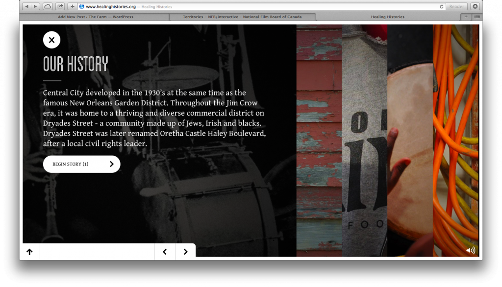
When you click on one the of the strips, it expands to provide more detail about the story and a link to “Begin Stories”:
I think this approach is pretty cool and could be effective in mimicking the strips of cloth on a loom (if you make the strips horizontal instead of vertical, like the weft on a loom). I was planning to write about this site and its design sometime soon. Then, a few minutes ago, I came across another interactive story that uses a similar effect: Territories. Seeing this second site inspired me to write this post.
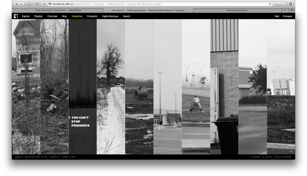
Here’s how the story topics are organized on Territories:
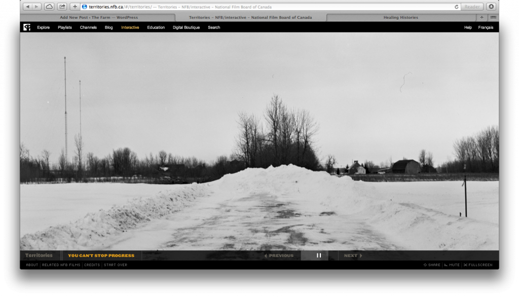
When you click on the topic, instead of expanding, like in Healing Histories, it opens up the story in a separate screen:
I’m not sure which approach—expanding the story while still showing the other strips or moving to a separate screen with chosen story—I like better. After doing a little more exploring, I realized another key difference between the sites. While Healing Histories allows you to still see the “strips” screen when you click on the topic, once you click to “begin stories” you can’t see the strips again unless you click a reset button and start the entire experience (including the introduction) over. In contrast, after moving away from the “strips” screen to a separate story page on Territories, you can get back to the strips page at anytime by clicking on the “Territories” link at the bottom left. I like the idea of being able to return/refer back to the strips page at anytime. But I also like the idea of the strip expanding, but staying on the same page where the other strips are visible. Maybe we could combine elements from each of these designs?
Would that be too complicated? Speaking of complicated, in using the loom as a model, I’m creating stories on the weft (horizontal) and the warp (vertical). Is it possible to create a design that shows the horizontal strips and the vertical frame? Hmmm…
Additional Note: After writing this post, I visited both sites on my iPad. Only Healing Histories works. Territories uses flash. I want my site to simultaneously work on all devices.
STA just sent me a link about a recent (December 10, 2013) Rolling Stone interactive article. It uses parallax scrolling in some interesting ways, so I’ve decided to offer a quick analysis of it here.
After scrolling through the entire story my first thought: Is it responsive? The answer: Yes. But the responsive version is more limited, lacking many of the fancier features of the full site, features that make it immersive, like sound and background video. Still, I’m glad to see that it’s responsive (unlike most? all? of the sites that I’ve analyzed on this blog). And the story does have some creative ways of translating its interactive features from laptop to mobile. Here are two:
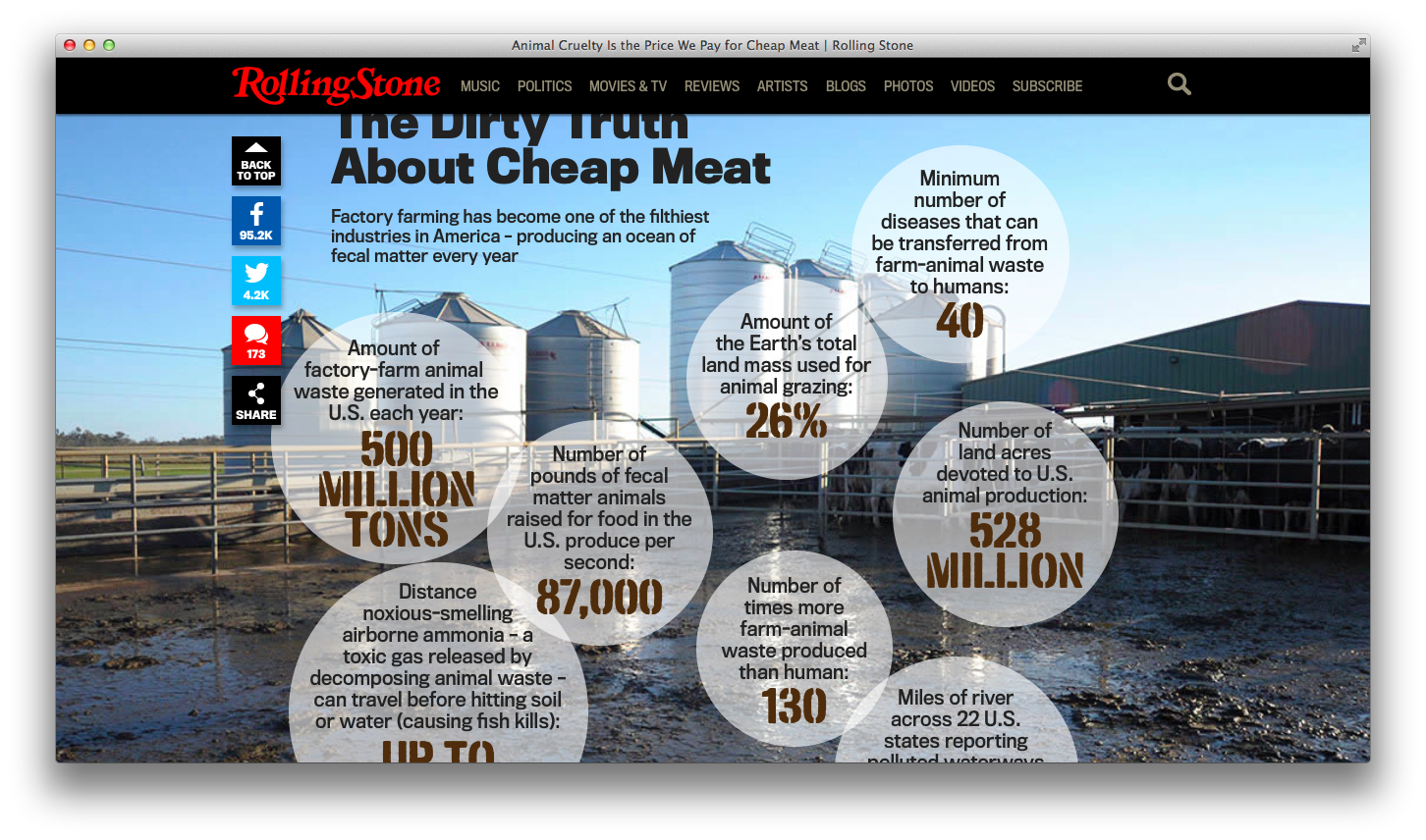
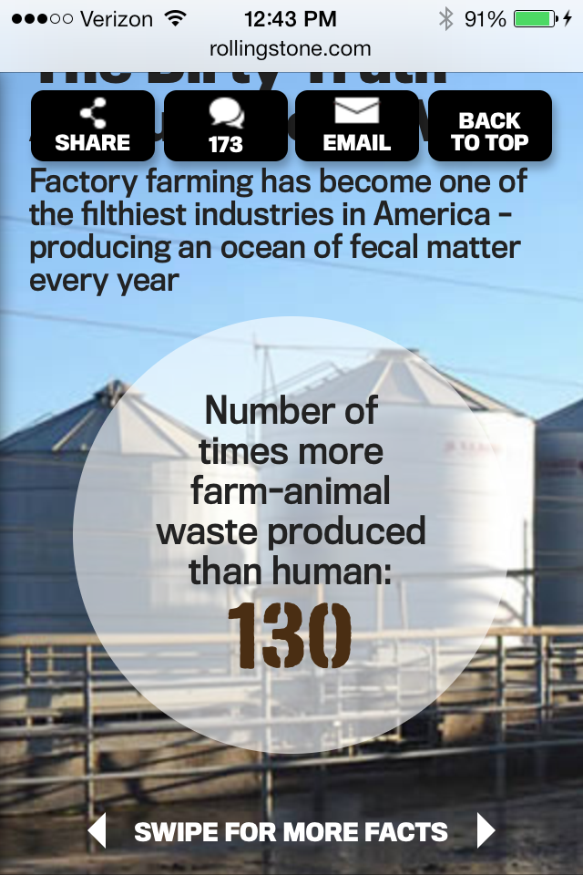
1. Check out the different ways the story displays facts about “the dirty truth of cheap meat”:
In the laptop version, as you scroll down the page, the image of the outdoor feed lot appears as “fact” bubbles pop up and the sounds of cows mooing play. Very slowly the image zooms in as most of the bubbles disappear. Combining the moving image with the sounds of the livestock and the dis/appearing fact bubbles, creates an immersive (and entertaining) effect. Does it encourage the user to spend more time paying attention to the facts? Not sure.
Full Laptop VersionMobile Version
In the mobile version, you scroll down to a static image of the feed lot with a text description. There is no music and the “fact” bubbles don’t pop up. Instead one of the bubbles appears, with the instructions: “swipe for more facts.” Swiping allows you to read all of the facts, one at a time. While it isn’t as much of an “experience,” with no moving images or sound, swiping individual fact bubbles does enable you to spend more time reading and thinking about the facts.
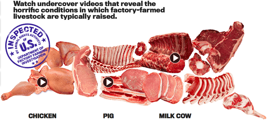
2. Check out the different ways the story displays undercover footage about how animals are raised on factory-farms:
In the laptop version, the videos are embedded in an image of different cuts of meat. When you click on one of the video icons a slide show (in a light box) appears. You can then click on the video to watch it, or click through to the next video.
Full Laptop versionMobile Version
In the mobile version, there is no image to click on. Instead, the series of videos, with descriptions, appear as you scroll down. You can read the descriptions and tap on the video icon to watch the footage.
Comparing the different ways of displaying information on the laptop vs. mobile makes me curious. Does one version work better? What is the relationship between the mobile and laptop versions? How can I take into consideration their differences as I’m crafting my stories?
Partly inspired by Room 34 and all of the work STA has done on Responsive web design, I have decided to make my project responsive. What does that mean? Very simply put, a responsive website is a single site that works on many different devices, from smartphones to tablets to laptops. So, you don’t have to create a separate site for the phone and another for the laptop; the same content scales down (or up) to fit your device.
I like this approach, partly because STA has been proselytizing about responsive for a few years now, but mainly because I want folks to be able to engage with my stories on any number of devices and I don’t want to fiddle with making sure the content that I use isn’t too big or too small for a phone or with needing to create multiple sites (mobile and desktop).
As a user, I prefer responsive sites over non-responsive ones. It’s annoying to have to zoom in to read text or see an image and then keep moving the site around to read the rest of the content. On a responsive site, since the content is scaled to fit the device, you don’t have to fiddle with that. You just need to scroll down normally to read everything.
For my current site, I’m using a free, and very popular, WordPress theme: Responsive. I like that it’s free and that it has been (so far, at least) easy to customize it.
MobileDesktop
In my preliminary research on other interactive documentaries, I’ve been surprised to see that most (all?) of the sites that I’ve found are either not available for smartphones (Welcome to Pine Point and Hollow: The Film), or aren’t fully scaled to fit phones (Reframing Mexico and The Waiting Room). Why not? Is responsive too limiting in what it allows you do with stories? Are digital storytellers turning to apps for their interactive documentaries instead?
Pondering all of these questions has also got me thinking: are responsive sites (like my Responsive site) accessible for visually impaired viewers? If not, what can I do to make sure that my stories meet these accessibility requirements?
note: In checking this post out on the phone, I realized that the title “Responsive!” was not…responsive. I plan to go in and fix the font size for the mobile version right now.