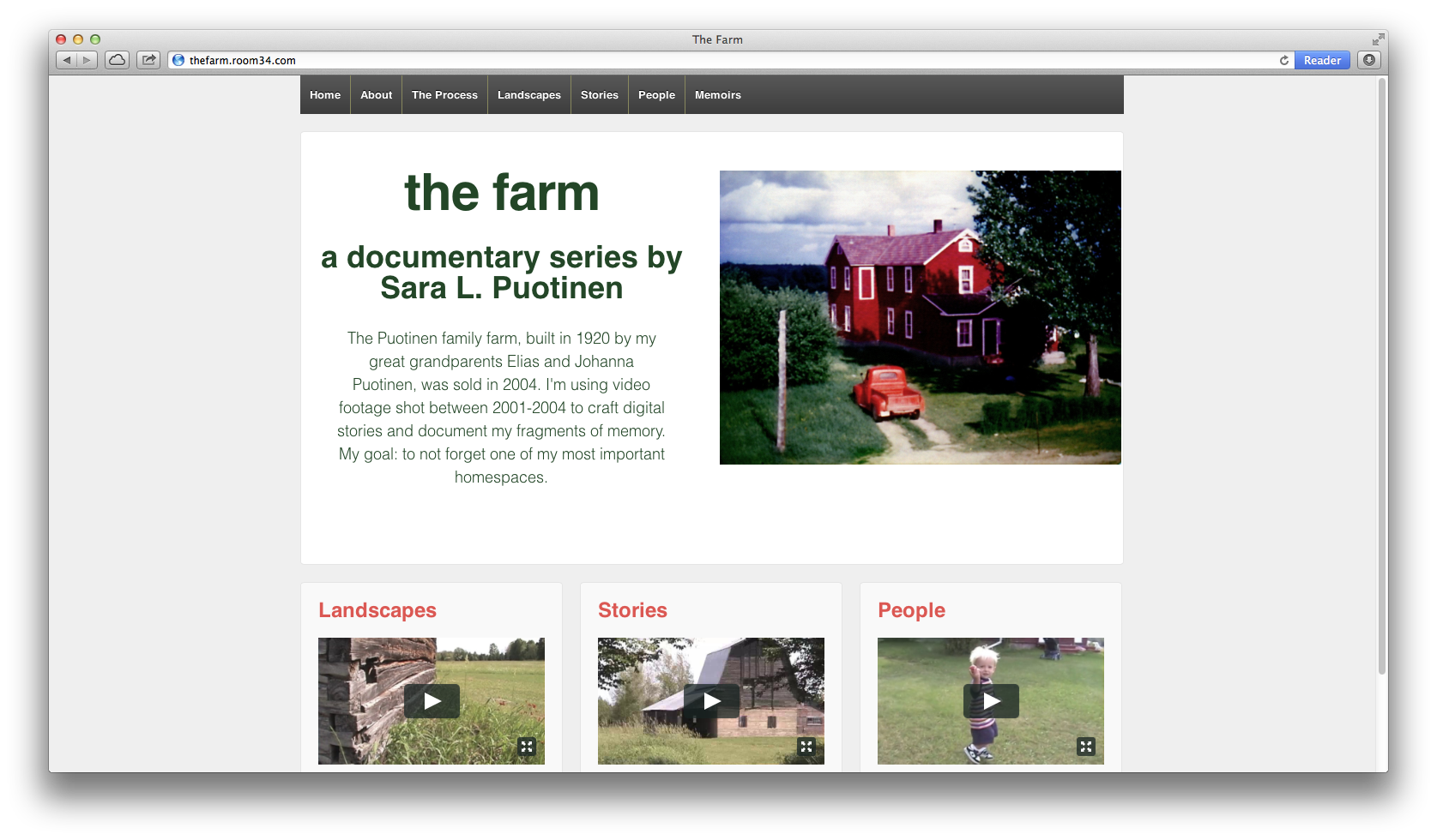
Partly inspired by Room 34 and all of the work STA has done on Responsive web design, I have decided to make my project responsive. What does that mean? Very simply put, a responsive website is a single site that works on many different devices, from smartphones to tablets to laptops. So, you don’t have to create a separate site for the phone and another for the laptop; the same content scales down (or up) to fit your device.
I like this approach, partly because STA has been proselytizing about responsive for a few years now, but mainly because I want folks to be able to engage with my stories on any number of devices and I don’t want to fiddle with making sure the content that I use isn’t too big or too small for a phone or with needing to create multiple sites (mobile and desktop).
As a user, I prefer responsive sites over non-responsive ones. It’s annoying to have to zoom in to read text or see an image and then keep moving the site around to read the rest of the content. On a responsive site, since the content is scaled to fit the device, you don’t have to fiddle with that. You just need to scroll down normally to read everything.
For my current site, I’m using a free, and very popular, WordPress theme: Responsive. I like that it’s free and that it has been (so far, at least) easy to customize it.

In my preliminary research on other interactive documentaries, I’ve been surprised to see that most (all?) of the sites that I’ve found are either not available for smartphones (Welcome to Pine Point and Hollow: The Film), or aren’t fully scaled to fit phones (Reframing Mexico and The Waiting Room). Why not? Is responsive too limiting in what it allows you do with stories? Are digital storytellers turning to apps for their interactive documentaries instead?
Pondering all of these questions has also got me thinking: are responsive sites (like my Responsive site) accessible for visually impaired viewers? If not, what can I do to make sure that my stories meet these accessibility requirements?
note: In checking this post out on the phone, I realized that the title “Responsive!” was not…responsive. I plan to go in and fix the font size for the mobile version right now.