Analysis: Flawed

15-150x150
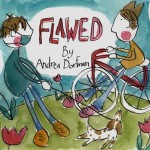
So, my first analysis, Snow Fall, was created by the New York Times. My next, Reframing Mexico, was created through a collaboration between UNC Chapel Hill and Tecnológico de Monterrey. Both of these projects involved documenting stories from many different people. Now, for my third analysis, I will focus on an interactive documentary that was created by and is centered on the experiences/stories of one person, the artist/filmmaker Andrea Dorfman. It’s called Flawed.

Design Elements

  • flash-based, must reload every time you click on site
  • hosted on NFB of Canada site with links for site on top navigation bar and links for specific project on bottom navigation bar
  • project nav bar includes: Start Over, About Flawed, Interactive Tool, Study Guide, Related NFB Films
  • stop motion animated six minute film
  • background music automatically plays once loaded, but can be muted

Content

  • story about filmmaker’s journey to embrace her flaws
  • stop motion animated 6 minute film
  • while author tells her story about being flawed in voice-over, we watch, through stop-motion animation, the artist draw and paint illustrations of her story/stories
  • doc also includes about author page and an interactive tool, “embracing your flaws”
  • interactive tool enables you to click on different body parts of illustrated figure of author; author recounts stories about why those parts are “flawed” and why she embraces those flaws
  • study guide for 7th-12th grade
  • does not include entire doc short. see here for full 12 minutes.

Responsive?

No.

Storytelling

  • creative mix of voice-over with stop motion animation
  • compelling narrative about embracing one’s flaws
  • mix of personal memories about author’s experiences with her body, especially her “big nose”
  • stories also told through interactive tool. user has greater ability to disrupt/shape story experience here
  • focused exclusively on her stories and her perspective

Interactivity

  • interactive tool, users can click on body parts to hear stories about author’s flaws
  • teaching guide with questions and advice on how to watch
  • find and watch related films on NFB site

Strengths

  • compelling, creative, entertaining story with great message
  • cool interactive tool, using author’s body as story map
  • great use of stop motion animation

Weaknesses

  • not responsive, flash-based
  • must reload documentary every time
  • needs more ways to interact (e.g.: could pose more questions for thought/reflection like, What’s your biggest flaw? How did you embrace it, etc? incorporate the study guide into the interactive doc more, instead of just as a pdf. allow users to comment or contribute their experiences and stories)
  • sound is automatically on until you mute it

Things to Use?

  • interactive tool: instead of the map of her flaws/body, a map of the farm and its buildings
  • add in study guide?

After writing the above analysis but before posting it online, I decided to watch the full documentary for Flawed. It had been screened at many different film festivals and on PBS’ POV a few years ago and was very popular. I was surprised by how the full version was the same story, but with various details edited out. I guess I was expecting the full documentary to include the interactive story, plus another story or two about her flaws. Watching both versions makes me curious. I wonder, how do the edits change the story? How did the artist choose which details to leave out and why?

For more of Andrea Dorfman’s great work, see her website.

Analysis: Reframing Mexico

Screen Shot 2013-09-12 at 2.41.27 PM

I found this “online documentary project” a year ago and was immediately impressed with many of its features and its focus:

about

As I began working on my analysis for this site, I realized that one important part of my assessment was not mentioned in my first interactive doc. analysis on Snow Fall: interactivity. What are the different ways that the audience can interact/participate in the project? So, I’ve added it to my analysis below.

Design Elements

  • home page offers (almost) full-screen slideshow that starts on an introductory video, then cycles through featured stories (image which, when clicked, starts a Vimeo video + summary + related material)
  • embedded Vimeo videos
  • 12 key organizing terms/clickable links at top of homepage
  • navigation bar includes icons for home, films, info graphics + EN (english) and ES (spanish) + an info icon (credits)
  • bottom right corner provides links for comments (Facebook social plugin) + icon links to the 2 universities that collaborated on project
  • site pages (accessible through clicking on one of 12 terms at top) are grids (one big rectangle + series of smaller rectangles) with video or info graphics
  • each content box uses icon to identify type of content
  • on info graphic page, content boxes light up when you mouse over them + they open light box when you click on them. Info graphics include one page graphs/charts/info, games or multi-page content

Responsive?

No.

Content

  • Series of individual stories about different people living in Mexico, told in their own words (short videos)
  • A mix of stories, combined with history, demographic information and games
  • Features on goth culture, Mexican wrestling, running a family quesadilla stand, fighting against disability discrimination, etc.

Storytelling

  • Non-linear, no beginning, middle, end
  • Multiple ways of accessing and engaging with information
  • Multiple perspectives and interpretations of content (videos are re-used to highlight different key terms)
  • Focus on subjects communicating stories in their own words
  • Emphasis on visuals

Interactivity

  • comment, using facebook social app
  • play games
  • click on links/stories you want to and when you want to (direct order/shape of the stories)
  • share site with others (using “share this”)

Strengths

  • nice use of grid design and Vimeo video embeds
  • strong organization, with clear ways to navigate and understand content + multiple ways to access information
  • clear and compelling mission: to allow user to rethink how they understand Mexico and reframe how it’s represented
  • great introductory video: brief (only 47 seconds), compelling, uses footage from various digital stories

Weaknesses

  • not responsive
  • not enough interactivity, participation by user
  • feels too much like a standard website
  • too many themes (12) w/relatively small amount of content repeated in different theme

Things to Use?

  • icons identifying type of content in  boxes
  • grid design?
  • clear/compelling organization with themes (but fewer)
  • separate pages (easily accessible) for each type of content
  • short video introduction
  • homepage slideshow?

While scrolling through this site, I clicked on the Multimedia Gallery for the UNC School of Journalism and found this cool online documentary: Finding the Uwharries.

Analysis: Snow Fall

As I think through how to develop my farm project into an interactive documentary, I want to do an analysis of many different docs already online. Today’s Interactive Doc: Snow Fall

Screen Shot 2013-09-10 at 12.59.35 PM

Design Elements

  • parallax at top, with cinemagraph? of snow
  • standard text/copy
  • embedded brief video of survivors [less than minute]
  • animated video of mountain/map
  • embedded photos
  • thumbnails on left side of victims, links to slideshows
  • big slideshow
  • gallery of photos (not clickable links)
  • video footage of ski route
  • audio clips

Responsive?

Yes

Content

  • Traditional journalism
  • story about avalanche
  • single event w/context

Storytelling

  • Traditional linear narrative
  • w/supplemental material

Strengths

  • beautiful footage
  • interesting and useful content
  • responsive
  • powerful video footage
  • cool use of parallax (with cinemagraphs) at top
  • turned into an ebook
  • static nav bar at top
  • combined footage into 10 min documentary

Weaknesses

  • too linear/traditional narrative
  • margins on website–doesn’t fit wide screens
  • too much text, not enough creative use of material
  • no links to extra content, only embedded…would like extra page w/resources + links

To Use?

  • ebook idea
  • audio footage
  • thumbnail slideshows w/people?
  • combine footage into one longer doc?

Note: Since their success with this Snow Fall story, the NY Times has been working on a new interactive documentary with the super-cool National Film Board of Canada: Highrise. It will debut at the New York Film Festival at the end of this month.

Addendum as of 9.11.13: I just got a free sample of the ebook for this interactive documentary. Very disappointing. Unless I’m missing something, it’s just the text, without any of the online interactive features. Why not incorporate the videos, audio, images into the text?