I like the way that questions are posed to the user in Reinvention Stories and how answers appear on the screen. This could be useful in my question section:
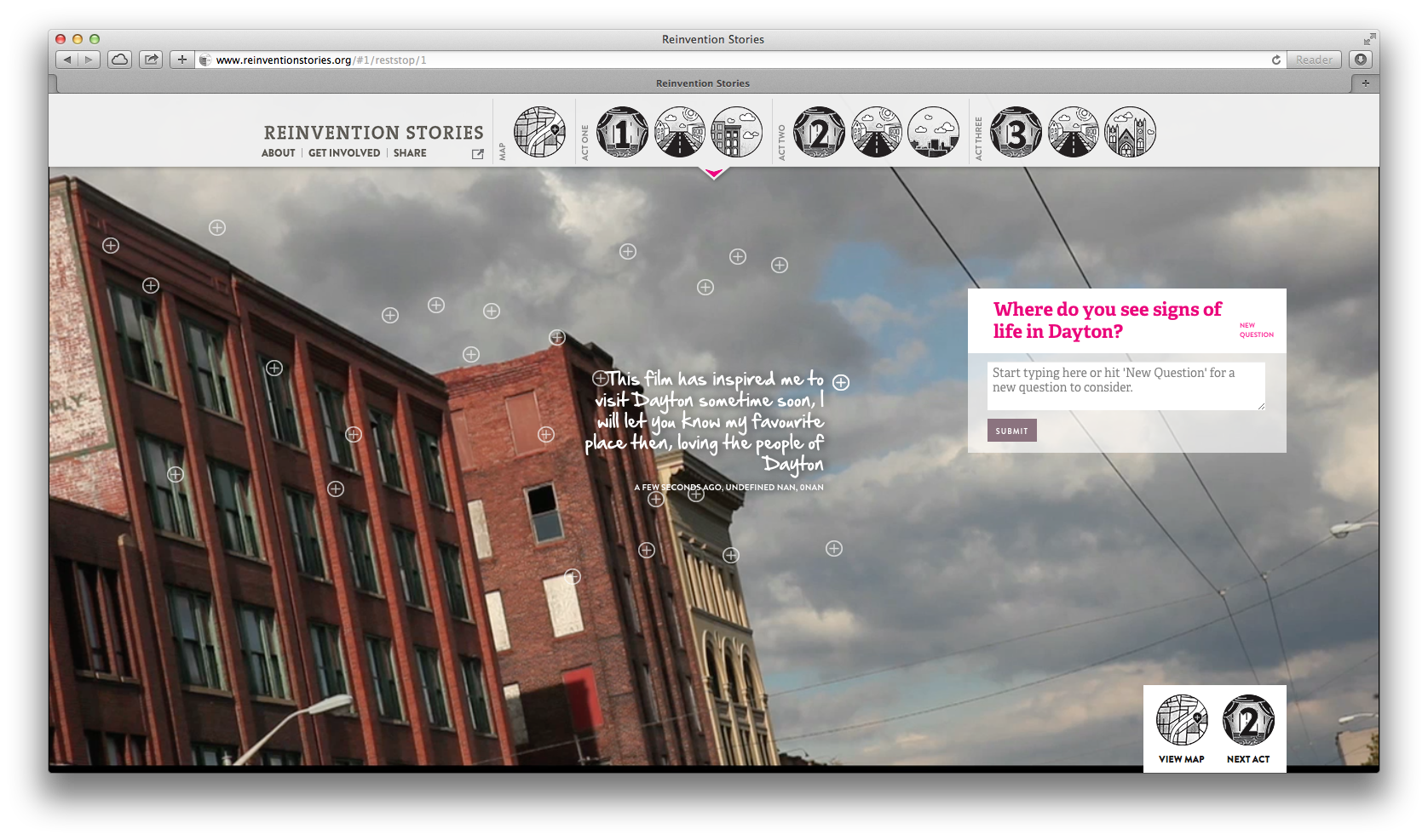
I like the way that questions are posed to the user in Reinvention Stories and how answers appear on the screen. This could be useful in my question section:
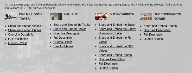
As I was scrolling through the “collaborative documentary experiment,” Highrise, I found this approach for making it easy to share materials about and from it. When I have some time, I’ll check it out and think through whether or not it’s useful for the searchable database I’m planning to include in my interactive story project.
I wanted to make note of this cool design feature on the Powering a Nation site:
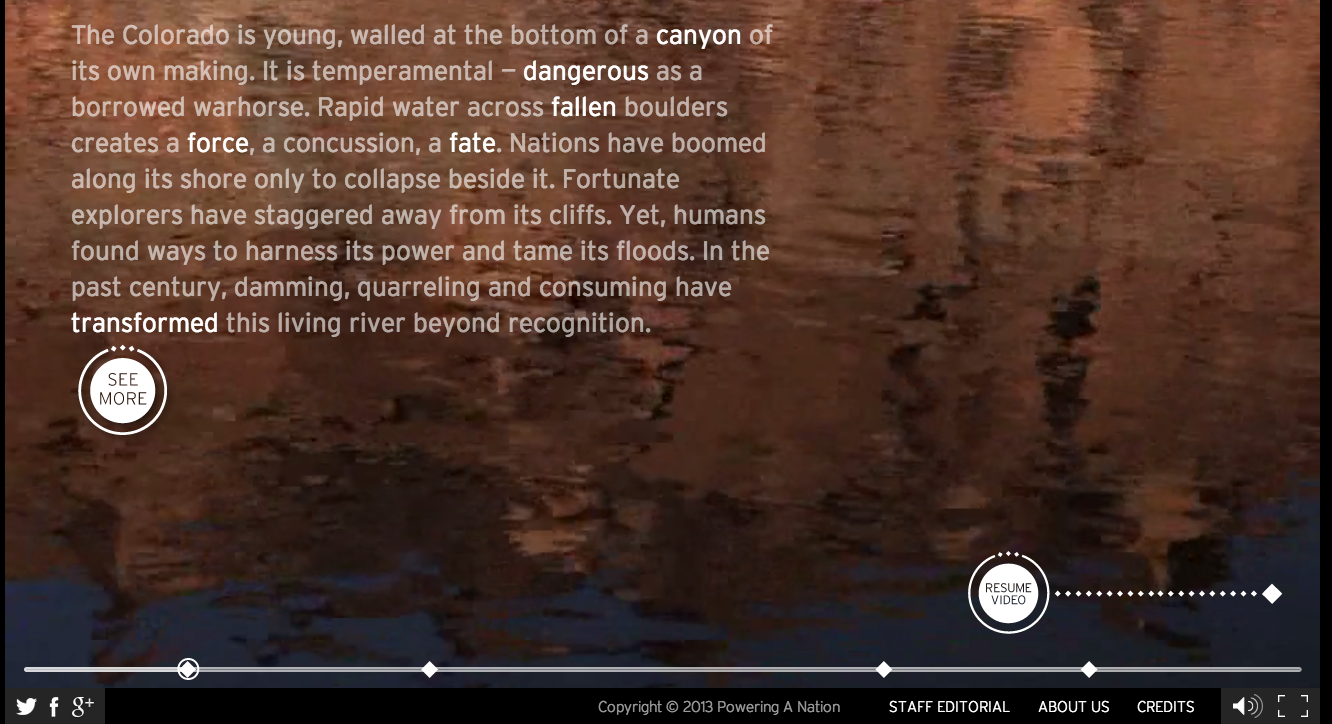
I like how they use the diamonds as chapter markers. While you can’t see it in the screen shot, when you scroll over the diamonds the chapter titles appear. When you click on them the movie (almost) immediately jumps to the next chapter. Cool.
I also like how the text gradually appears on the screen in this section. From this:
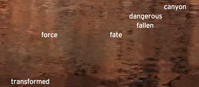
to this:
As I think through what kind of storyteller I want to be and how I want to craft, tell and share my stories, I’m revisiting one of my early inspirations: Trinh T. Minh-ha’s “Grandma’s Story” from Woman Native Other. In the second farm film, The Farm, part 2: The Puotinen Women, I matched four different quotations from this chapter with Puotinen storytellers: the farm, Ines Puotinen, Judy Puotinen and me (Sara Puotinen). This morning I looked over some notes for the film and discovered another quotation:
In this chain and continuum, I am but one link. The story is me, neither me nor mine. It does not really belong to me, and while I feel greatly responsible for it, I also enjoy the irresponsibility of the pleasure in the reproduction. No repetition can ever be identical, but my story carries with it their stories, their history, and our story repeats itself endlessly despite our persistence in denying it.
Trinh T. Minh-ha
I want to play with this idea of being responsible and irresponsible. I feel a responsibility to pass on the stories of past generations, but I feel (in bad and good ways) that my passing on of those stories is irresponsible. On one hand, I worry that I don’t know enough, haven’t experienced enough, am not old enough, to tell the stories. On the other hand, I feel exhilarated and inspired by the process of sifting through the accounts, interviews and photos and crafting them into new stories to share with others. I want to tell these stories. In fact, I need to tell these stories.
In thinking about how to incorporate (and hopefully) maintain the tension between being responsible and irresponsible, I want to feature some clips of my sister Anne and my mom discussing the farm and how they could take responsibility for it when it was “their time.” I wonder, is it my time? What does “my time” mean when the farm is no longer in the family and my mom is dead?
In this analysis, I’m looking at the recent (it went live just a few months ago) interactive documentary, Hollow. Here’s a description of the project from the Kickstarter page (they raised over $28,000 for production and completion):
Hollow is an interactive documentary and community participatory project that focuses on the lives of residents in McDowell County, West Virginia. Hollow combines personal portraits, interactive data, participatory mapping and user-generated content on an HTML5 website designed to address the issues stemming from stereotyping and population loss in rural America. Community members will take part in the filmmaking process by creating their own documentary portraits and balloon maps. Hollow strives to bring attention to issues in rural America, encourage trust among the community and become a place where users can share ideas for the future.
note: While many of the other interactive documentaries that I’ve looked at or reviewed offer an about page directly on the site, I couldn’t find one here. Did I just miss it?
QUESTION: How much can/should the creator control the user experience? How much freedom should the creator give to the user? When does freedom create too much confusion and chaos?
Sections:
No.
This is a really cool interactive documentary, that is visually stunning and that offers a lot of great content. I’m bothered by the parallax scrolling and the efforts of the filmmaker to control the user’s experience. Is this the only way to create a mood and to immerse the user in the documentary, forcing them to scroll through and only giving them access to the material in one way? I hope not. I’d like to create a site that provides the user with more freedom and more access to the information in many different ways, but that doesn’t allow that freedom to confuse or over-complicate the stories.