I finally got around to watching the amazing documentary, Stories We Tell, by Sarah Polley. Such a great film from a wonderful storyteller.
Month: December 2013
Quick Analysis: Rolling Stone Article
STA just sent me a link about a recent (December 10, 2013) Rolling Stone interactive article. It uses parallax scrolling in some interesting ways, so I’ve decided to offer a quick analysis of it here.
After scrolling through the entire story my first thought: Is it responsive? The answer: Yes. But the responsive version is more limited, lacking many of the fancier features of the full site, features that make it immersive, like sound and background video. Still, I’m glad to see that it’s responsive (unlike most? all? of the sites that I’ve analyzed on this blog). And the story does have some creative ways of translating its interactive features from laptop to mobile. Here are two:
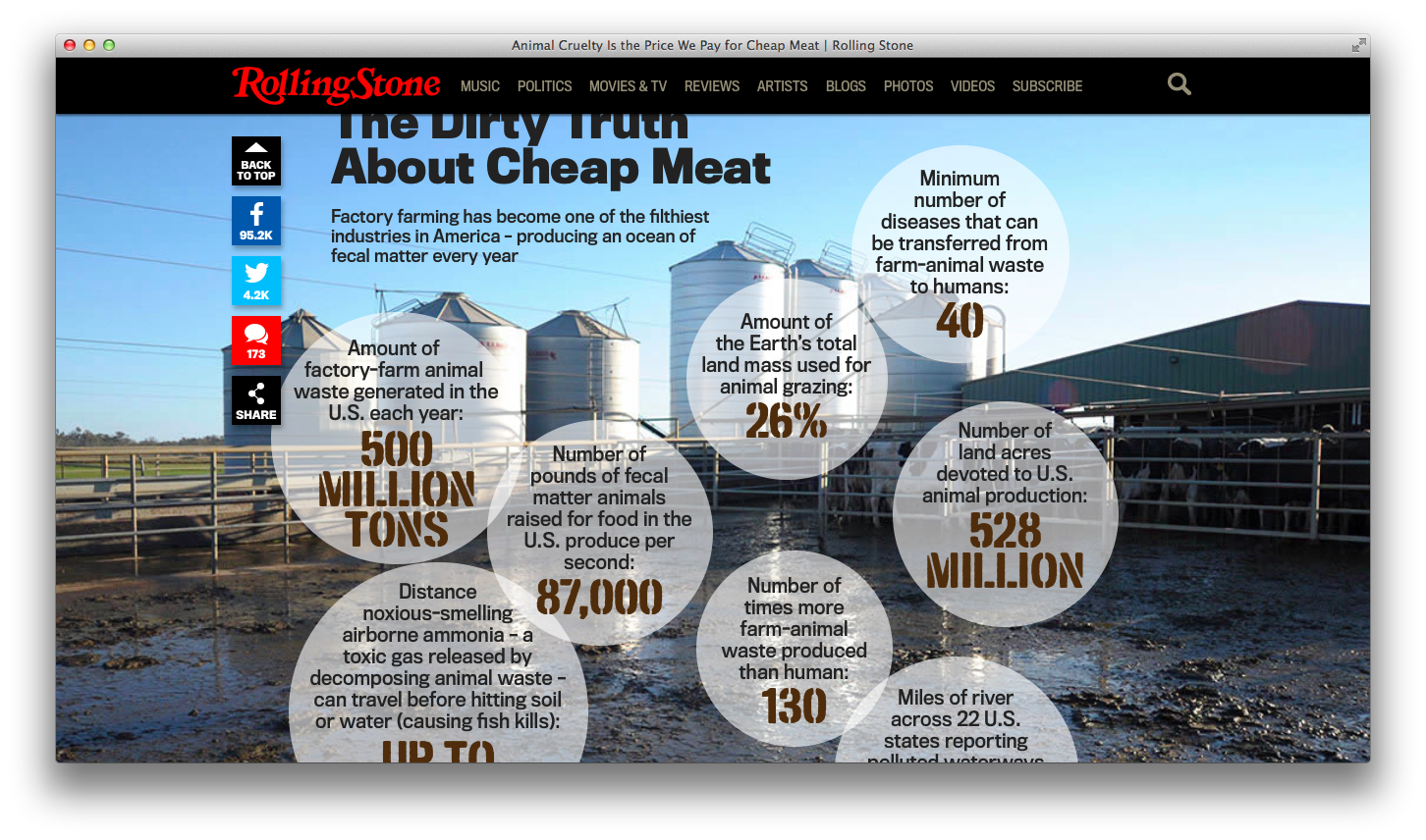
1. Check out the different ways the story displays facts about “the dirty truth of cheap meat”:
In the laptop version, as you scroll down the page, the image of the outdoor feed lot appears as “fact” bubbles pop up and the sounds of cows mooing play. Very slowly the image zooms in as most of the bubbles disappear. Combining the moving image with the sounds of the livestock and the dis/appearing fact bubbles, creates an immersive (and entertaining) effect. Does it encourage the user to spend more time paying attention to the facts? Not sure.
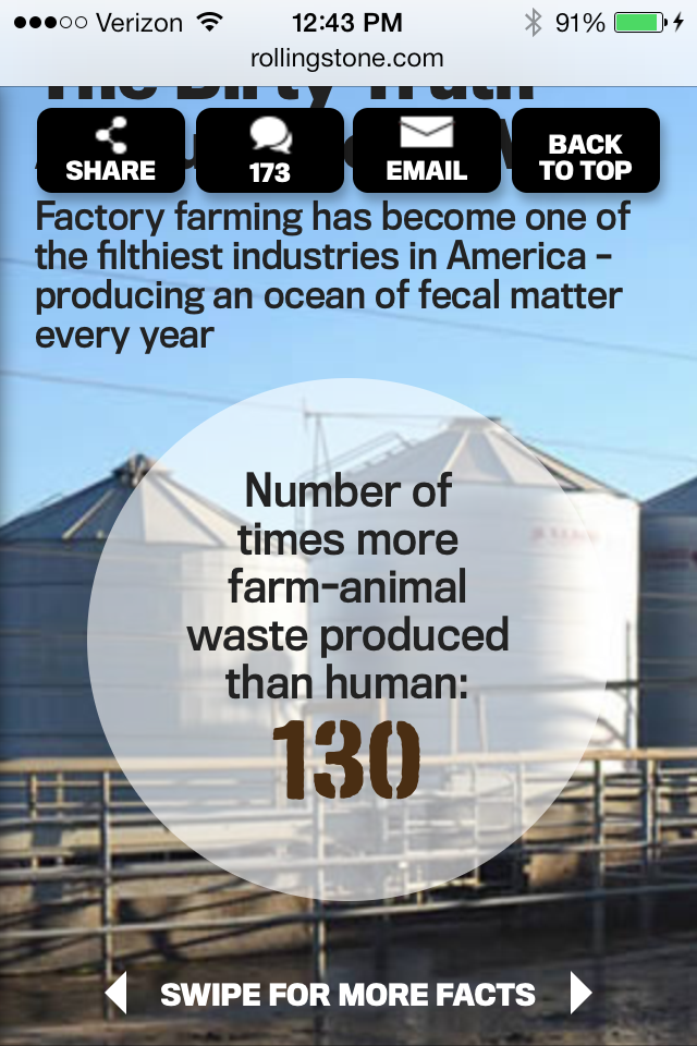
In the mobile version, you scroll down to a static image of the feed lot with a text description. There is no music and the “fact” bubbles don’t pop up. Instead one of the bubbles appears, with the instructions: “swipe for more facts.” Swiping allows you to read all of the facts, one at a time. While it isn’t as much of an “experience,” with no moving images or sound, swiping individual fact bubbles does enable you to spend more time reading and thinking about the facts.
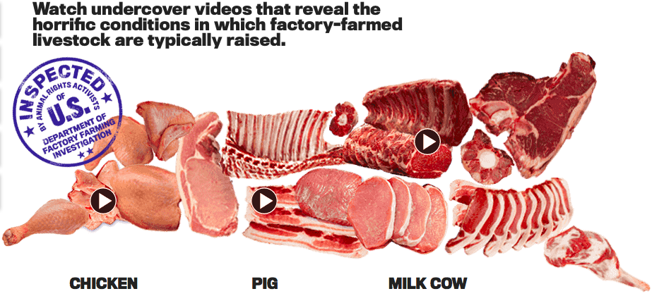
2. Check out the different ways the story displays undercover footage about how animals are raised on factory-farms:
In the laptop version, the videos are embedded in an image of different cuts of meat. When you click on one of the video icons a slide show (in a light box) appears. You can then click on the video to watch it, or click through to the next video.

In the mobile version, there is no image to click on. Instead, the series of videos, with descriptions, appear as you scroll down. You can read the descriptions and tap on the video icon to watch the footage.
Comparing the different ways of displaying information on the laptop vs. mobile makes me curious. Does one version work better? What is the relationship between the mobile and laptop versions? How can I take into consideration their differences as I’m crafting my stories?
Site Redesign
While I haven’t been posting as much on this blog lately, I’ve been working hard on planning my project. Hopefully soon I can actually start building it. For now, I’m in the process of tweaking my site, both content and design. I envision this site as the placeholder for a more elaborate site, designed with the help of Room 34, so I’m trying to keep it pretty basic.
Yesterday I decided to add a background image. Why? Partly because I just figured out that you could do that and it seemed much more interesting than the bland blue that I had been using. Initially I wanted to use a close-up on the weathered boards of the barn or the grain shed, but I really liked this photo my mom took of the farm house:
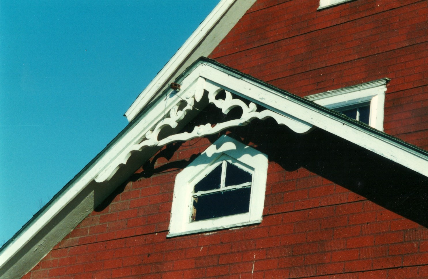
I must admit, I always found the fake red siding that my grandparents put on the farmhouse to be pretty ugly. But looking at it now, it conjures up strong feelings of being at the farm. I love the contrast between the red siding, the white trim and the bright blue sky. The blue is so intense that I can almost smell the fresh air. I miss that air.