Analysis: Hollow

In this analysis, I’m looking at the recent (it went live just a few months ago) interactive documentary, Hollow. Here’s a description of the project from the Kickstarter page (they raised over $28,000 for production and completion):

Hollow is an interactive documentary and community participatory project that focuses on the lives of residents in McDowell County, West Virginia. Hollow combines personal portraits, interactive data, participatory mapping and user-generated content on an HTML5 website designed to address the issues stemming from stereotyping and population loss in rural America. Community members will take part in the filmmaking process by creating their own documentary portraits and balloon maps. Hollow strives to bring attention to issues in rural America, encourage trust among the community and become a place where users can share ideas for the future.

note: While many of the other interactive documentaries that I’ve looked at or reviewed offer an about page directly on the site, I couldn’t find one here. Did I just miss it?

Screen Shot 2013-09-26 at 12.09.32 PM

Design Elements

  • desktop only, not accessible on tablet or phone…trying to raise money to create app
  • lots of parallax scrolling in different directions: side to side and up and down with cut-out images, occasional animation, lush backgrounds + sound scrolls too
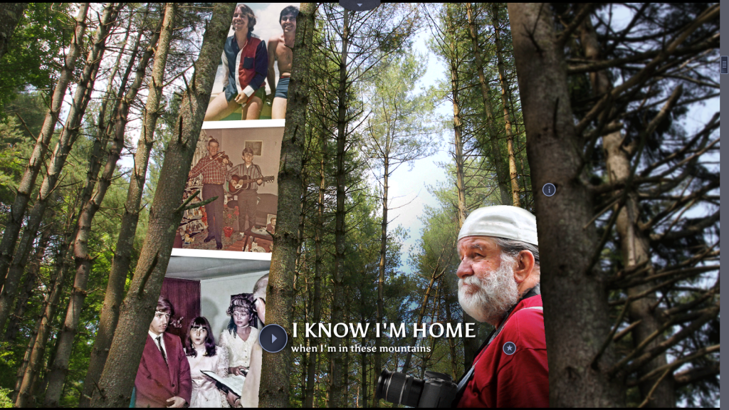
  • beautiful images and video of West Virginia (image-heavy)
  • text used in brief quotations or headlines, not many lengthly descriptions on screen (unless you click on info buttons)
  • creative collages
  • navigation bar at bottom of screen, can click on different chapters at any time
  • pages must load
  • icons on screen: i for information + triangle for video + star for bonus material (which can be unlocked once you watch the videos)
  • continuous sound (background noises + music), automatically loads, but can be muted
  • tons of content in each section, only available when scrolling through site, no resource page. (I’m noticing a real effort to create and control the user experience. Did the filmmaker choose to not have a resources page because they wanted the user to experience the interactive documentary the way they wanted them to? This seems to be a frequent desire from filmmakers). 

QUESTION: How much can/should the creator control the user experience? How much freedom should the creator give to the user? When does freedom create too much confusion and chaos?

Content

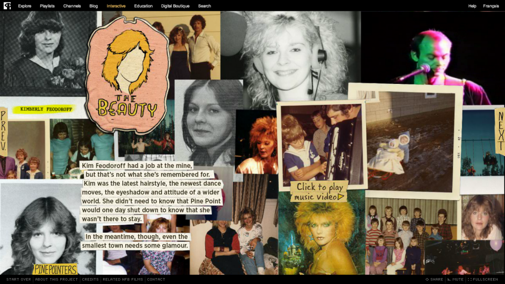
  • bunch (how many? not sure) short, 2-3 minute video portraits/interviews of residents
  • footage from various residents (parents getting footage of baby, at the swimming pool, parade, riding on an ATV trail)
  • quotations from interview are featured on screen, when scrolling after watching films
  • infographics with statistics about area and its residents
  • sharing stories of love for community, desire to fix it

Sections:

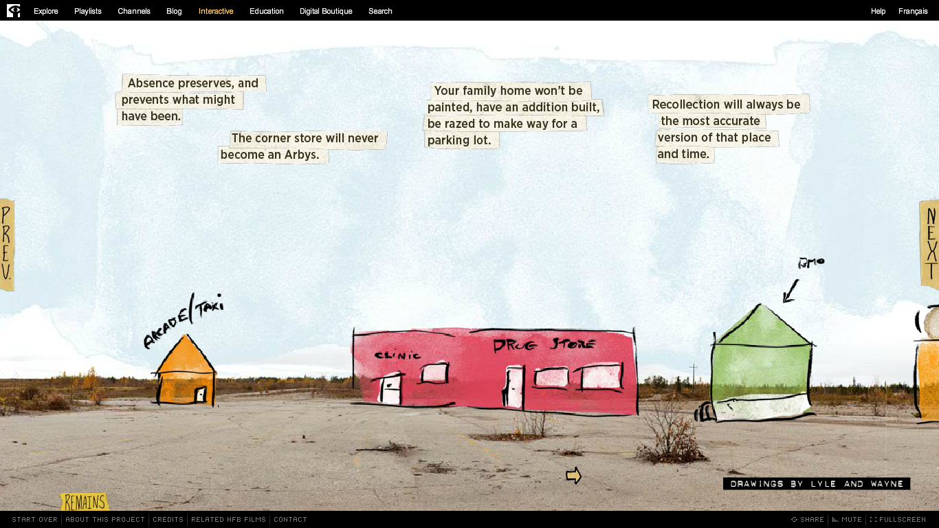
  1. The way it was: really cool scrolling infographic detailing history of rise and fall of county.
  2. These roots: on love of place, sense of connection, home
  3. For each other: community, coming together in crisis (flood of 2012), community projects, sports (football, swimming)
  4. For the land: drug culture, tourism, fishing/trout, housing/construction, creating new businesses
  5. When coal was king: history of county when prosperous through photos and videos (cool technique of focusing in on old photo of person and then fading into a current photo of them (which leads to video interview), October Sky festival, mining/mine-related illness/impact of mining
  6. Around the bend: the future, hope

Responsive

No.

Storytelling

  • linear in terms of sections, starting with the past (section 1) and ending with the future (final section)
  • centered around characters more than actions
  • created to evoke a mood and sense of respect for the specific place
  • mostly through images, sounds and video
  • reminds me of Ursula K. Le Guin’s idea of story as house

Interactivity

  • scrolling through at own pace, can click on tons of different icons for information + videos + bonus material
  • throughout doc there are opportunities to contribute content: tag pictures of home on hollow’s instagram page, answer survey questions

Strengths

  • beautiful
  • very effective in immersing user in story, enabling them to feel and experience the county
  • creative displays of infographics
  • cool use of parallax, creating collages of image, video, sound

Weaknesses

  • too much parallax, it gets really annoying and tiring
  • must wait at every chapter for it to load. This can get annoying if you’re trying to go back and forth between chapters.
  • experience is too controlled by structure of site and filmmaker. While there are opportunities for interacting, they are heavily shaped by how filmmaker wants you to experience the documentary
  • not responsive
  • no resource page or way to access all of the information (videos, images, information) unless you tediously scroll through each chapter. Sure, this creates a “cool” mood and a powerfully immersive experience, but users may want to access the information again and in different ways.

Things to Use?

  • the quotations, pulled out of the interviews and featured on their own page
  • icons for type of content (information, video, bonus material. maybe?
  • soundscapes? Not sure. Can be too intrusive, but I like the idea of background sounds to help evoke a mood.

Summary

This is a really cool interactive documentary, that is visually stunning and that offers a lot of great content. I’m bothered by the parallax scrolling and the efforts of the filmmaker to control the user’s experience. Is this the only way to create a mood and to immerse the user in the documentary, forcing them to scroll through and only giving them access to the material in one way? I hope not. I’d like to create a site that provides the user with more freedom and more access to the information in many different ways, but that doesn’t allow that freedom to confuse or over-complicate the stories.

Analysis: Welcome to Pine Point, pt 2c

Here is (hopefully) the final installment in my analysis of Welcome to Pine Point(pt 1, pt 2a, pt 2b)

chapter five: Shelf Life

On the opening page of this chapter, the text reads:
Screen Shot 2013-09-20 at 1.55.14 PM

I’m bothered by the last line:

Who can relate to an entire town closing except people whose town has closed?

What does the narrator mean by this question? And what is its intent? While I’d like to read it as an introduction to the next two pages in the chapter, when two Pine Pointers discuss leaving Pine Point, that’s not the immediate effect. I read the question as another example of the narrator positioning people in Pine Point as exotic others that we (the users) can gaze upon and learn about. We, because we can’t relate to them (but who says everyone who might read/view that “we” can’t relate?), are different from people in Pine Point. Not sure if this makes sense?

chapter six: What’s Weird

On the opening page of this chapter, there is an unidentified (and disembodied) voice discussing how it’s weird to think about Pine Point not existing anymore. On the page is a split screen with two sets of footage: on the left is Pine Point 1987, with various buildings, on the right is Pine Point 2009, with barren fields. It’s a powerful page, made even more powerful by the haunting music in the background.

Screen Shot 2013-09-20 at 2.07.21 PM

chapter seven: Remains

This chapter discusses how losing the town meant it never changes—it can’t, it’s gone. This allows Pine Pointers to not just remember it, but memorialize it as a wonderful place, where nothing bad happened.

Screen Shot 2013-09-20 at 2.28.21 PM


This text seems to be the answer to the question that open the entire documentary:

Screen Shot 2013-09-19 at 1.12.23 PM

This chapter also introduces the “big surprise”/twist of the story (which I won’t reveal here).

chapter eight: One for the Road

On the final page of the interactive documentary, the narrator wonders:

Screen Shot 2013-09-20 at 2.27.05 PM

Then, he answers:
Screen Shot 2013-09-20 at 2.32.04 PM

This passage fits the overall tone/mood of this interactive documentary. Again, it positions the narrator (and us, I think?) as forever distanced from the Pine Pointers. We will never know how they feel/what they felt—we can’t understand—because their experiences are too different from ours. What would this story look like if he had asked Pine Pointers if they were happier? If there were (more) accounts (or, because it’s an interactive documentary, opportunities for them to share their stories online) of their responses to this question.

I deeply enjoyed this interactive documentary and count it as one of my big inspirations, so my critical questions aren’t meant to devalue or dismiss it. I think my persistent questions about the narrator and how they position themselves (and us) as distanced from the subjects of the story come out of my own struggles to figure out how I want to position myself as a narrator in the farm project.

More on that later…

Analysis: Welcome to Pine Point, pt 2b

Yesterday, I posted part 2a of my analysis of Welcome to Pine Point. In it I focused on the introduction and chapter one (Town). In this post, I’ll continue making my way through the interactive documentary. Up first, chapter two: PinePointers

Screen Shot 2013-09-20 at 9.15.13 AM

This chapter is dedicated to four people from Pine Point (why only 4? why these 4?). It’s divided into two main sections: Then, with 4 pages, one dedicated to each of the people/characters and what they did/looked like in high school, and Now, with 4 pages, one dedicated to each of the people/characters and what they do/look like now.

I like both the concept of having a separate chapter dedicated to  people and the visual style that’s used in each of the pages. While the style doesn’t seem fitting for my project, I am interested in thinking through how I could do something similar. It’s helpful (and visually powerful) to have all of the pictures together instead of in a slide show that you need to click through. One thought: Instead of individuals, I could have generations? 

chapter three: Ends and Odds

This chapter includes memorabilia (photos, a video, “Pine Point Memories,” artifacts/objects) and the narrator’s brief reflections on memory objects.

Screen Shot 2013-09-20 at 9.39.00 AM

In their interviews and about this project page, the Googles discuss the origins of this project: they had been planning to do a book about “the death of the photo album as a way to house memory.” After visiting the Pine Point Revisited website, they decided to focus on creating a interactive documentary about Pine Point instead.

I like the subtle ways in which their interests in photo albums and ideas about memory and memory objects are woven into the Pine Point narrative in this chapter. My farm project is heavily influenced by my research and scholarly interest in identity, home, memory and belonging. I’d like to find ways to bring those theories in without it being overbearing or too jargon-y (or text heavy). This project provides a good model for how to make room for larger (deeper?) reflections that aren’t too “academic” or heavy-handed.

I also like their page about Richard’s hats. The page has a full screen video of Richard trying on each of the dozen hats that he had and wore when he lived in Pine Point. A brief explanation of the hats is offered in text which is layered over the video:

Screen Shot 2013-09-20 at 9.53.17 AM

chapter four: Cosmos 954

This chapter offers the juxtaposition of the narrator’s (Michael Simon’s) hazy memories of living in Yellowknife, Canada when a Russian satellite (Cosmos 954) came crashing down with the seemingly sharper memories of Pine Pointers in fights,  guest lists at their many parties, or the burning down of Pine Point’s high school.

Do I like this section? I can’t decide. I’m intrigued by the narrator’s story in this documentary. It’s wistful, nostalgic and reverent. He seems to long for the clear memories and accounts of happy experiences that the Pine Point Revisited site depicts. While this perspective makes for a compelling story, what stories and perspectives does it leave out or ignore?

design note: On one of the pages in this section, the text is layered over a full-screen slide show that mixes still photos with documents (poems, newspaper accounts) of the high school fire. I like the effect. How difficult is it to do with this treatment? Will it load too slowly on most computers?

chapter five: Here to Work

Wow, I like this section! It provides more reflections on memory and the work of shaping experiences into stories or legends. It really has me thinking about my struggles with memory, nostalgia, storytelling and our inclinations to memorialize things in ways that aren’t truthful. I especially like their comments on this page:

Screen Shot 2013-09-20 at 10.16.23 AM

Grinding down the memories into raw superlatives…a memory depends on who we need to be at the moment of remembrance….These ideas resonate with me. The farm project is definitely shaped by my experiences in 2001-2001, when I started it, and 2002-2013, when I’m (hopefully) finishing it. I’d like to incorporate some discussion of my experiences into the project.

Analysis: Welcome to Pine Point, pt 2a

In a previous post, I offered a general overview analysis of Welcome to Pine Point. In this post, I’ll provide more specific details and discussion about what I find useful and inspiring in this interactive documentary.

Screen Shot 2013-09-19 at 12.29.03 PM
Intro

Storytelling: I like the intro as a narrative about how/why this project about Pine Point came to be:  Creator (Mike Simmons) describes his limited experience in Pine Point—visiting there once as a kid—and how an encounter with a website, dedicated to remembering Pine Point, enabled him to reflect on both his own memories of living as a teenager through the 70s/80s and the individual and collective memories of teenagers in Pine Point (PinePointers).

I’d like to include my own narrative as part of the intro to the farm project. It seems important to set the context, trace the history of the project and explain my reasons for why I’ve created the project.

Design: I really like the use of background video in the intro. It’s video that sets a mood, without telling a specific story. I particularly like the use of it in the very first page. It starts with some grainy/shaky footage of a field. Then slowly, (seemingly) handwritten text appears on the screen with the question, “Imagine your hometown never changed…would it be so bad?” I like this opening question and how it gets me thinking about change, hometowns, nostalgia, memory and growing older. Unfortunately the question only lasts on the screen for a few seconds before animation begins and the project title emerges. How are you supposed to read and think through the question so quickly? Why bother asking the question at all if you don’t provide users with enough time/space to reflect on the question?

Screen Shot 2013-09-19 at 1.12.23 PM

I’d like to include questions throughout my project. And I’d like to borrow from their visual style here by using background footage with text layered over it. But I want these questions to serve as an opportunity for thinking, reflecting and processing. So I want them to stay on the screen longer: either have the text last longer or provide users with ability to pause the screen.

Sound: Throughout Welcome to Pine Point, there is background music. Oftentimes it is an instrumental score, but occasionally it also includes relevant sound effects (e.g.: glasses clinking, people having fun on the page about how PinePointers seemed to be “holding a decades-long party.”)

I’d like to use sound in my project. Not sure how to do that since the sound I have from past footage isn’t the greatest. I know that I want to use a lot of Room 34’s music (in fact, I already have).

Chapter One: Town

In Welcome to Pine Point, Mike Simmons (who is half of the creative team, the Googles, who created this doc), inserts his own narrative, which doesn’t always “fit,” beside the story of Pine Point. For example, in the chapter “Town,” the first 2 pages offer a brief description of the town and its demise. The next page is a brief story about how Simmons decided to visit Pine Point again, but stopped in his old Northern Canada hometown first.

Screen Shot 2013-09-19 at 1.26.34 PM

Screen Shot 2013-09-19 at 1.26.57 PM

In later chapters, he also inserts himself into the story. I’m not sure how I feel about this. I like the idea of his story being a part of the project and I like that he mixes it in with the other stories. But his interjections also establish him as the author/ity in this story; he is our guide and who we turn to for information, interesting facts and meaning. With his limited connection to the town, having only visited there once, why is he the authority? Why not the creator of the website, Pine Point Revisited?

I’d like to insert my self in my farm project stories. But, I want to leave (a lot of) room for other voices to serve as authors/authorities in my project. How to do that? That’s a huge question, one I’ve been grappling with ever since I began working on the farm project, way back in 2001.

Wow, this analysis is raising some great questions for me, but it’s also taking a lot of time. I guess I need to turn it into a few blog posts.

Analysis: Welcome to Pine Point, Pt 1

The interactive documentary, Welcome to Pine Point, was one of the first inspirations for my online documentary project/s. I love this 2011 project and its concept of creating an online “public photo album” that could serve “as a touchstone for people who lived there, but also, for those who didn’t.”

Screen Shot 2013-09-18 at 12.09.10 PM
My approach to analyzing the first three interactive documentaries (Snow Fall, Reframing Mexico, Flawed) doesn’t seem to work as well for this project; it doesn’t allow me to give enough detail. Welcome to Pine Point offers so many sources of inspiration for me, that I feel I must do a much closer (lengthier, detailed) analysis of its elements and content. So, I’m breaking this analysis up into two parts. In part one, I’ll provide an overview of the interactive documentary. In part two, I’ll provide a more detailed account of features that I’d like to use or that are particularly inspiring for me in my own project.

Design Elements Overview

  • flash-based, must reload every time you click on site
  • hosted on NFB of Canada site with links for site on top navigation bar and links for specific project on bottom navigation bar
  • project nav bar includes: Start Over, About this Project, Credits, Related NFB Films
  • combines animation, still photographs, old video, new video, text, music

Content

  • account by creators of their experiences at Pine Point + reflections on remembering and place
  • background video of Pine Point
  • old footage from Pine Point in the ’80s
  • chapters: Intro, Town, Pine Pointers, Ends and Odds, Cosmos 954, Here to Work, Shelf Life, What’s Weird, Remains, One for the Road,
  • slideshows + images of memorabilia + yearbook shots (tons of historical content!)
  • interviews with Pine Pointers

Responsive?

No

Storytelling

  • creative weaving together of various stories: history of town and its demise + history of individual Pine Pointers + history of era (80s) + history of storytellers (who have only limited connection with Pine Point: outsider?)
  • immersive: with soundtrack and background footage + memorabilia
  • provides multiple layers of information, enables user to view/read/craft their own story about Pine Point

Interactivity

  • click through different chapters at own pace (click arrows to go forward–next and backward–previous).
  • click on slideshows, with multiple images and footage, or skip them and move on
  • click on icons in introduction for text

Strengths

  • very well done weaving of creator’s personal perspectives in with the stories from Pine Point
  • nice balance between documenting history, sharing material and reflection on place and memory
  • creative visuals, especially use of background footage with old footage + audio interviews
  • love the incorporation of so much archival material that user can choose to access (or not)

Weaknesses

  • flash-based
  • not responsive
  • must reload every time and for every chapter
  • navigation: no way to pick a chapter, must click through entire story, one page at a time correction: I just figured out how to pull up the chapters, so my critique is wrong here. But, my overall impression that you are strongly encouraged to page through, from beginning to end, still seems accurate, especially after reading some interviews with the creators.

Things to Use?

see next post