Quotations

A brief digression: When I was in college, I had a professor who was a stickler for grammar. He was particularly intolerant, as I recall, of incorrect uses of it’s or its and of references, either in verbal or written form, to the words that one cites from authors as quotes. The correct word for these cited words, he would patiently explain, was quotations not quotes. Even after 20 years (wow!), I still think about his grammar admonishments when I carefully type quotations instead of quotes. Admittedly, I sometimes just write quotes. After stopping to do a bit of research on the topic, I discovered that “quote” is  acceptable, just less formal. 

This digression makes me curious about the benefits and drawbacks of formal language, especially in the context of higher education. Should teachers continue to emphasize formal language, like quotations instead of quotes, over informal language? What, in terms of serious engagement with ideas/concepts, gets lost or gained when we don’t enforce certain grammar rules? My inclination is to support more expansive ways (formal and informal) of expressing ideas. But, are there certain rules that should continue to be maintained? If so, what are those rules? When do those rules become alienating and elitist, limiting access for certain groups of people?

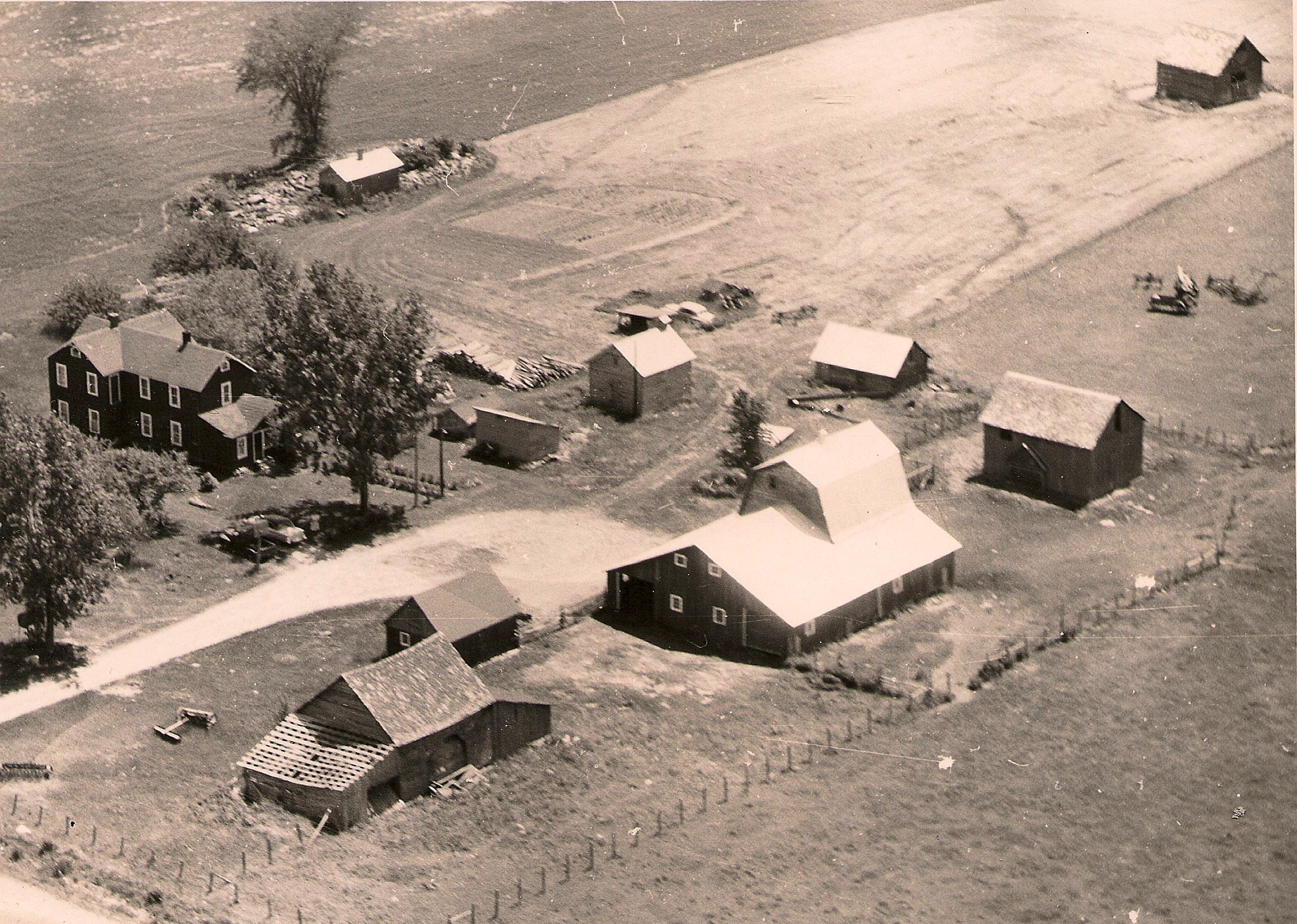
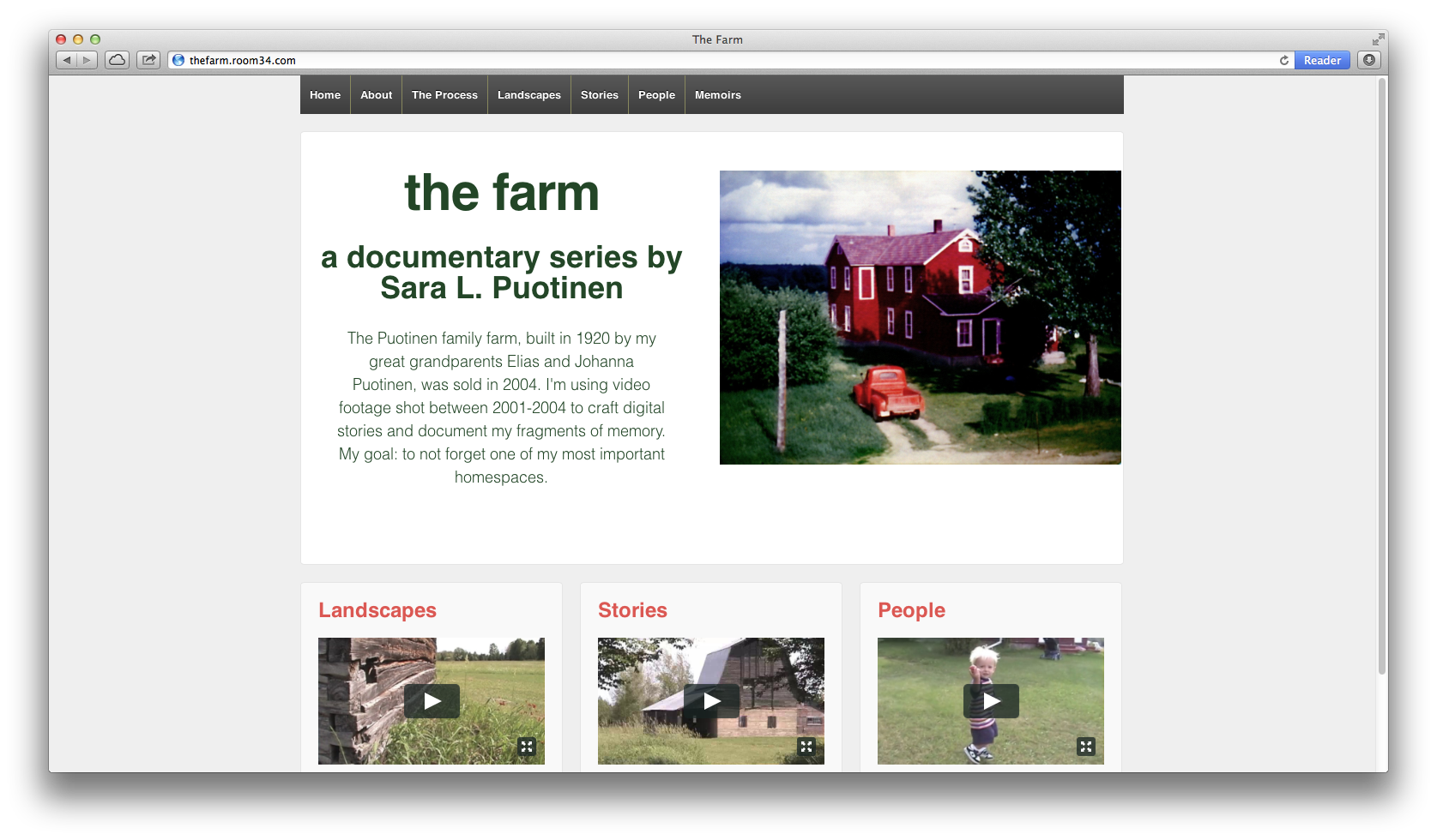
In some ways, this digression seems out of place on a blog about the process of creating an interactive documentary about my family’s farm. But, at the heart of this project, is my desire to take ideas that I encountered as a graduate student and professor about storytelling and narrative selfhood and make them accessible to a wider range of audiences. So, reflections on access are connected to my reflections on the process of creating this site.

Of course, this digression was not the intended topic of this post. I’m interested in discussing my current experiments with how to tell stories about the farm using quotations in combination with video footage, photographs or other archival material. I’m just starting to work through how these quotations might work in terms of design (how will they look? font size? placement on page? how to make them work responsively?) and in terms of content (which passages should I pick? how many should I have?)

I like the idea of using quotations because I have a lot of interview footage with my dad in which the sound quality is really bad. I’m sure someone could use fancy and expensive software to enhance his voice, but I don’t have the time or money for that. Plus, I think it’s important, especially with an interactive documentary, to play around with the format; I want more than just a series of videos. I want to use words and images in other ways too.

I like how the interactive doc Hollow uses quotations via parallax scrolling. Pretty cool. Here are some screen shots (for the full effect, you need to visit the site and scroll through):

Screen Shot from Hollow

Screen Shot 2 Hollow

As you scroll to these quotations, music is playing in the background. I like the effect and the feeling it gives you of being immersed in the story. But, this particular interactive doc is not responsive; you can’t even access it on a mobile device. And, you must scroll all the way through the chapter to get to the quotations. I’d like to find a way to use quotations on a responsive site. I’d also like the quotations to be accessible in many different ways (nav bar, on different pages).

As I work through various options for using quotations, I’ll be posting various passages with images + videos on a new page I’m creating: Fragments.

An Overall Theme?

I’m currently trying to think through how to organize all of the material that I have for this project. What to include? What to leave out? What’s the most effective (engaging, compelling, intelligible) way to bring everything together? What should I use for the overall design?

To help me with these questions, I’ve been looking at other interactive documentary sites. Two that I particularly enjoy are Hollow and Reframing Mexico. I like Hollow because of the creative way it brings together digital stories with infographics, images and pull quotes by using a parallax design. It’s a beautiful, fun and immersive experience. But, I’m not sure if I really like parallax scrolling. It’s trendy and cool looking, but…. Is it too trendy? What sort of story/stories does it allow you to tell? Are those stories too linear? Is the way you engage with the information too directed (always compelled to move forward by scrolling down) by the design?

Hollow, which just went live last month, uses cool, “cutting-edge” techniques to provide information and tell stories that are compelling and that make you (almost) feel as if you’re in the West Virginia county. Reframing Mexico, which went live back in 2011, emphasizes easy, clear organization with themes, navigation bar buttons for quickly accessing all infographics and digital stories and for reading/viewing in English or Spanish. It lacks a little bit of the flair that Hollow has, but it’s beautiful too and I like how it allows the user to experience the stories and information in a number of different ways by clicking on the different links (themes, movies, infographics). It seems more accessible for a wide range of users (who speak different languages, are interested in different types of stories).

In thinking about my own approach to storytelling, I’d like to combine some of the elements from each of these sites: beautiful; effectively conveying moods/feelings; providing multiple ways to access and engage; displaying clear, yet compelling, organization. How? As a starting point, I’d like to focus the structure of the site (the information architecture) around this image of the farm from above:

farmfromabove

Perhaps this image/map of the farm could have clickable links to each of the buildings, and in-between the buildings, for stories, images, videos, archival material and more. Again, how? Time for some more research.

Responsive!

Partly inspired by Room 34 and all of the work STA has done on Responsive web design, I have decided to make my project responsive. What does that mean? Very simply put, a responsive website is a single site that works on many different devices, from smartphones to tablets to laptops. So, you don’t have to create a separate site for the phone and another for the laptop; the same content scales down (or up) to fit your device.

I like this approach, partly because STA has been proselytizing about responsive for a few years now, but mainly because I want folks to be able to engage with my stories on any number of devices and I don’t want to fiddle with making sure the content that I use isn’t too big or too small for a phone or with needing to create multiple sites (mobile and desktop).

As a user, I prefer responsive sites over non-responsive ones. It’s annoying to have to zoom in to read text or see an image and then keep moving the site around to read the rest of the content. On a responsive site, since the content is scaled to fit the device, you don’t have to fiddle with that. You just need to scroll down normally to read everything.

For my current site, I’m using a free, and very popular, WordPress theme: Responsive. I like that it’s free and that it has been (so far, at least) easy to customize it.

Mobile
Mobile
Desktop
Desktop

In my preliminary research on other interactive documentaries, I’ve been surprised to see that most (all?) of the sites that I’ve found are either not available for smartphones (Welcome to Pine Point and Hollow: The Film), or aren’t fully scaled to fit phones (Reframing Mexico and The Waiting Room). Why not? Is responsive too limiting in what it allows you do with stories? Are digital storytellers turning to apps for their interactive documentaries instead?

Pondering all of these questions has also got me thinking: are responsive sites (like my Responsive site) accessible for visually impaired viewers? If not, what can I do to make sure that my stories meet these accessibility requirements?

note: In checking this post out on the phone, I realized that the title “Responsive!” was not…responsive. I plan to go in and fix the font size for the mobile version right now.